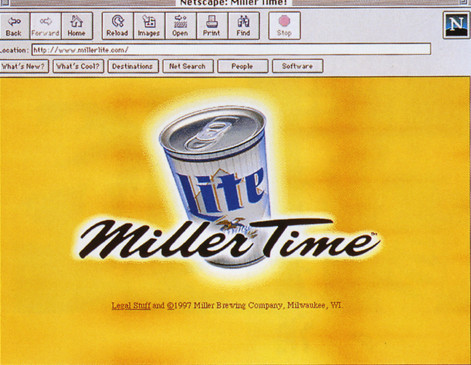
Miller Lite Website
Duffy Design, Minneapolis, Minnesota, 1996
Description
The design had to reflect the strategy of the advertising campaign. Miller Time is fun and unexpected, and the site had to be, too. The design closely matched the iconography of the advertising, using such things as a “beer”-colored background and the Miller Lite logo.
Collections:
Communication Graphics: 18 (1997)
Discipline:
Experience design
Format:
Advertisement, Website
Credits
- Design firm
- Duffy Design
- Creative director
- Joe Duffy
- Graphic designer
- Jeff Johnson
- Illustrator
- Jeff Johnson
- Copywriter
- Linus Karlsson
- Programmer
- Margaret Bossen
- Client
- Miller Brewing Co.
Loading...
Loading...


