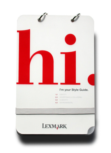
Lexmark Style Guide
Leo Burnett USA, Inc., Chicago, Illinois, 2003
Description
The problem was familiar: an international company needed consistency across their brand. A new comprehensive style guide seemed to be the solution.
First, we wanted to provide a useful tool that was both friendly and informative. Second, addressing all aspects of the brand from colors to product photography was a must, but we also added information like proofreading marks and standard envelope sizes to give it a life outside of simply displaying logo violations. Last, we chose a playful voice for the copy so that the tone of guide was not solely determined by rules and guidelines.
From a production standpoint, the guide needed to be expandable, easily accessible and, owing to its heavy use, quite sturdy. We chose to use plastics, a tear-resistant stock for the guide, and a detachable ring binding for later expansion.
Credits
- Design firm
- Leo Burnett USA, Inc.
- Creative directors
- Noel Hann, Andrew Meyer, Jim Stallman
- Designer
- Jeremy Smallwood
- Illustrator
- Vito Sabsay
- Production coordinators
- Colleen Capola, Elyse Mitchell
- Production artists
- Mark Capola, John Havemann
- Copywriters
- Pam Mufson, Jeremy Smallwood
- Printer
- Johns-Byrne
- Printing method
- Offset
- Binding method
- Detachable ring binding
- Papers
- 74 lb. Yupo cover, 25 gauge matte/matte frosted PVC
- Client
- Lexmark International, Inc.