


NetApp
Landor Associates, San Francisco, California, 2008
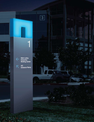
Description
Landor conducted extensive research with current, potential and competitors’ customers and concluded that NetApp was widely perceived as having superior technology and incredible customer service. To better communicate its desire for a strong human connection—unique commitment in the B2B and technology categories—we introduced a warmer visual identity and photo style. We also recommended that it formally adopt the simplified, friendlier—sounding name, NetApp—already in use as a nickname by many customers. To reinforce NetApp’s promise to do whatever it takes, and to go above and beyond for its customers, we developed fresh messaging, including the new humanistic brand line: “Go further, faster.”
Juror Notes
The interesting part is the activation of the symbol. It’s great that they took this simple shape and made it proprietary.
Credits
- Design firm
- Landor Associates
- Creative director
- Nicolas Aparicio
- Designers
- J. J. Ha, Henricus Kusbiantoro, Michael Lin
- Art director
- J. J. Ha
- Production director
- Jo Clarke
- Client
- NetApp