


Wee Society Branding
Office, San Francisco, California, 2012
Description
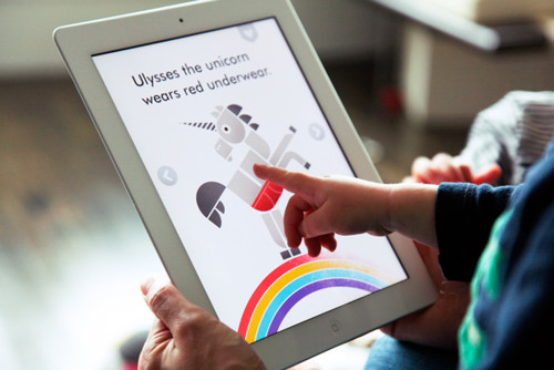
Wee Society, a brand of kids products created by the folks behind Office, is about raising good little people through happy design. The overarching goal is to create playful, colorful learning experiences that give kids a positive perspective on the world. With fun, engaging and beautifully designed products, Wee Society also hopes to give parents the tools to start conversations that will help build understanding, encourage empathy, inspire creativity, develop confidence and (hopefully) induce giggles. Office developed the brand strategy and all aspects of the brand experience: name, visual identity system, website, tone of voice, marketing communications and products (apps, art prints and wood blocks).
Read the full case study with juror comments here: [http://www.aiga.org/case-study-wee-society-branding/]
Juror Notes
Wee Society sets the bar for a vital, desirable and engaging user experience for children and parents alike. The consistent excellence of the system across channels and through tone illustrates an attention to detail often missing in children’s products. Wee Society is full of imagination and delight. This is a winner, from the entrepreneurial spirit that drove the concept to its meticulous and business-savvy execution. —Valerie Casey
Credits
- Design firm
- Office
- Client
- Wee Society