


Anthropologie
Anthropologie, Philadelphia, Philadelphia, Pennsylvania, 2010
Description
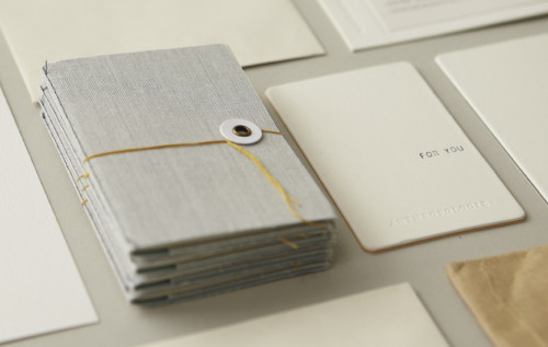
Project brief: Our objective was to update the Anthropologie logo and stationery system to feel clean and sophisticated while remaining tactile and textural. The challenge was to also design a base identity with flexible elements that speak to the changing variety, loves and times of our brand.
Approach: Our strategy was first to remove the bracketing from the Anthropologie logo and use material and printing techniques to add “detail” to the logo. The color palette was updated using shades of white with minimal pops of color. Texture and layering became an overarching theme: by layering materials, we were able to build texture while keeping the design elements clean and subtle. This layering approach also gave us flexibility with our budget. For example, the business card has a “universal” base with an interchangeable label that is customized per individual (when a business card is ordered, only the labels are printed).
Effectiveness: The end result of this redesign is a clean and functional stationery system that feels very in line with the Anthropologie aesthetic. The design embraces qualities that are tactile, textural, unexpected, detailed, authentic and layered.
Juror Notes
Precious and delightful.
Credits
- Design firm
- Anthropologie, Philadelphia
- Art director
- Carolyn Keer
- Designers
- Kathryn Fabrizio, Alana McCann
- Client
- Anthropologie