


Helvetica and the New York City Subway
Blue Pencil Editions, New York, New York, 2010
Description
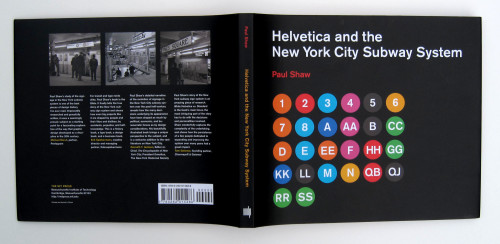
Project brief: I co-designed this book with the author Paul Shaw. It was our close collaboration that made this book such a success. Our objective was to merge text, images and notes into a single design so that the reader could see the images discussed in the text and refer to any footnotes without having to turn a page.
Our target audience was initially typographers and graphic designers but we quickly realized that the book would appeal to railway fans, New York City enthusiasts and urban historians. The response to the book has gone beyond our expectations. The original Blue Pencil version sold out within two months. The revised MIT Press edition is already garnering the same high praise and early sales are robust.
Approach: Author and co-designer Paul Shaw’s research, photos, passion and attention to detail are the heart of the book. Our collaboration helped realize the end product. Our goal for the MIT Press edition was to make the book available at a reasonable price while matching the quality of the original limited edition. We managed to retain the hardcover, add a book jacket and approximately 20 additional images and revise the text without adding pages or cost. This was a challenge we not only managed to meet but we also did so in a manner that improved the book’s design.
Effectiveness: We consider this edition for MIT Press a success because of sales and the enormous positive feedback we have received even before the book has been officially released.
We were eager for the book to achieve a wider distribution and Scott-Martin Kosofsky made that possible by not only selling the book to MIT Press but also overseeing its print production.
The book began as a modest tale of two typefaces but became the story of how a design becomes transmogrified by clients, bureaucracy and successive waves of designers. It has thus had a larger impact on the culture at large than was initially anticipated when it began life as a small essay for a niche audience. The audience of the original edition went way beyond New York to include readers throughout the United States as well as in Canada, England, Holland, Italy, Germany, Turkey and Japan.
Juror Notes
Helvetica success! The attention to detail really makes this appealing and frames the subject matter perfectly.
Credits
- Design firm
- Blue Pencil Editions
- Designers
- Abby Goldstein, Paul Shaw
- Jacket designers
- Abby Goldstein, Paul Shaw
- Production coordinator
- Scott-Martin Kosofsky
- Author
- Paul Shaw
- Publisher
- MIT Press
- Trim size
- 10 x 12
- Pages
- 132
- Typefaces
- AG Oldface, Berthold Akzidenz-Grotesk, BQ, Monotype Grotesque, Trade Gothic Next