Dining for Friends, poster
Henderson Bromstead Art Company, Winston-Salem, North Carolina, 2003
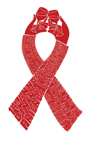
Description
Dining for Friends is an annual fundraiser for Triad Health Project, an AIDS service and support organization. Dinner parties are held throughout the community and guests are asked to donate to THP. The event usually raises several hundred thousand dollars in a single evening, which goes towards research, education and support for people in the area who have contracted HIV/AIDS.
On a daily basis, this health-care service deals with people who are sick and dying. It would make sense for the communication materials to reflect the somber nature of the care they provide. However, THP is an example of a group practicing though their communications the positive spirit that they try to reinforce among the people they help. In a field that often portrays the grave nature of their purpose, Triad Health Project has always taken the stance of providing hope through an uplifting message. With the Dining for Friends piece specifically, the annual fundraiser is seen not only as a remembrance of friends who have been lost, but a celebration of the lives they led.
For years, Henderson Bromstead Art Company has been given the challenge of creating a celebratory poster that announces the year’s Dining for Friends event. It’s a fairly simple and straightforward creative brief, yet every year we try to create a treasured piece that is more memorable then the previous year’s effort.
We immediately decided to use a simple, well-known icon to communicate the purpose of this event. However, concerned that the ribbon icon would be trite and is overused, we wanted to create our own version of this well-recognized mark to illustrate the celebratory nature of the Dining for Friends events. We settled on a toast—a simple, celebratory act that symbolizes a festive event and the honoring of someone. We also wanted to keep the bold, clean feel of the ribbon but had to communicate a lot of information on the poster. We decided to build the ribbon out of the type and have the large poster screen printed in one color.
The materials were very well received. Yes, the event was successful—more donations were received than the previous year, and THP was very pleased with the impact the posters made visually in the community. But the success of the poster can best be gauged by the fact that posters were stolen from store windows and bulletin boards all around town.
Juror Notes
Although reminiscent of other work done in this style, it is such a refreshing way to look at the red ribbon motif.
Credits
- Design firm
- Henderson Bromstead Art Company
- Creative director
- Hayes Henderson
- Art director
- Brent Piper
- Designer
- Brent Piper
- Illustrator
- Hayes Henderson
- Printer
- Serigraphic Industries
- Printing method
- Screen printing
- Paper
- French Smart white 80 lb. cover
- Typeface
- Custom
- Client
- Triad Health Project