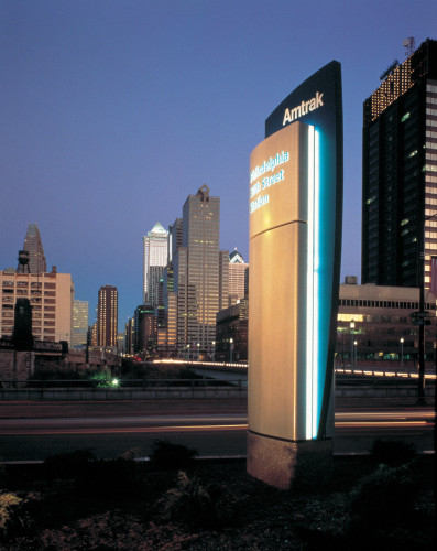
Amtrak’s Acela specialty station signage
Calori & Vanden-Eynden, New York, New York, 2000
Description
The primary goals of the sign program are to display relevant and real-time information, enhance the customer experience and use the sign system to impose Amtrak’s Acela brand identity on the entire passenger experience. Rather than being logotype-driven, the Acela program derives its branding strength from its sculptural forms. A sleekly curved “airfoil” shape became the stylistic nucleus of the entire signage program, which ranges from large ground-mounted pylons to smaller ceiling- and wall-mounted signs. The typical sign body is a double-airfoil shape, featuring two back-to-back curved panels, with some units intersected by a curved vertical fin to evoke movement. Further reinforcing the Acela identity, the sign program’s silver and teal colors match those of the new trains. The sign system distinguishes the premium Acela service from regular Amtrak service and is used only at the Acela gates and platforms. The LED displays provide train information to passengers along all points of the travel experience and engender a greater comfort level in passengers.
Credits
- Design firm
- Calori & Vanden-Eynden
- Creative director
- David Vanden-Eynden
- Project manager
- Jordan Marcus
- Designers
- David Vanden-Eynden, Chris Calori, Jordan Marcus, Denise Funaro
- Photographer
- Elliott Kaufman
- Typefaces
- Frutiger, Frutiger Bold
- Fabricator
- Andco Industries
- Software
- Adobe IIIustrator
- Client
- Amtrak/National Railroad Passenger Corporation


