Red Snapper, A Pale Blue Dot
Non-Format, Saint Paul, Minnesota, 2008
Description
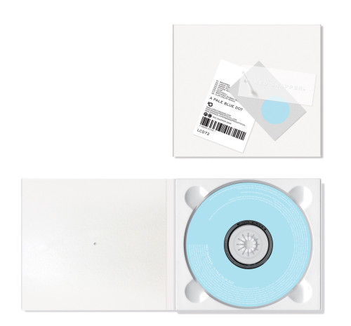
In an attempt to reinforce Red Snapper as a brand, we borrowed the visual language of fashion retail material. By diverting the usual print budget away from the digipak, the packaging became an exercise in minimalism, with emphasis on materials and production techniques. A collection of swing tags, each with its own visual and textural characteristics, became the core design elements of the packaging. A “super-embossed” PVC tag, a silk-screen-printed gray board tag, and a litho-printed white card tag are secured to the blank digipak with a thin plastic kimble tag, which also fastens the digipak closed. If the kimble tag is cut, the three swing tags can be stored in the pouch on the inside flap of the digipak.
Juror Notes
Irresistibly clever idea. Wonderful that all communication sits only on the hang-tags; brave and elegant.
The unexpected is delivered, the use of materials restrained.
Anti-packaging is intriguing. The elements that are usually hidden are now featured.
Credits
- Design firm
- Non-Format
- Art directors
- Kjell Ekhorn, Jon Forss, Gavin O’Shea
- Designers
- Kjell Ekhorn, Jon Forss
- Typefaces
- Custom logotype, Hermes
- Client
- Lo Recordings
- Production director
- Vincent Oliver