


Black Grace
Alt Group, 2007
Description
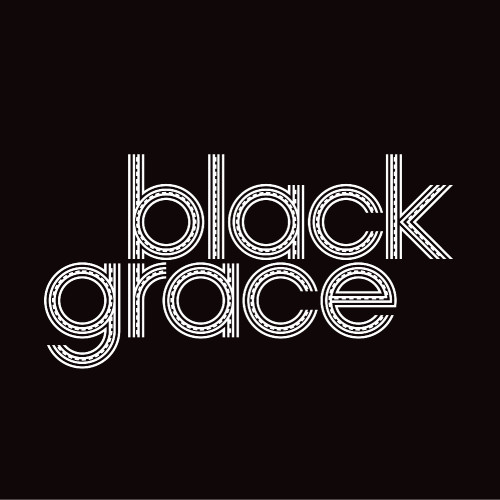
Typography exists to honor content, like music, dance and anything else that lends grace to language. Rather than create a singular mark to represent Black Grace, a Pacific contemporary dance company, a typeface was created to become the voice of Black Grace.
The display face reflects the art of the tattoo. In Pacific culture, tattooing has a huge significance: a person’s mana, their spiritual power or life force, is displayed through their tattoo. The act of leaving a mark celebrates the individual’s endurance and dedication to cultural traditions. The elaborate geometrical designs, representing both male and female tattoo patterns, are combined with typographic forms based on the geometric faces of the early 20th century. The typeface has a tone, timbre, character and form that create a sense of visual movement. When the type is placed over an image, it still reveals what is underneath. It is not just read—it is also looked through. Like the tattoo, the typeface is just as much about making a mark as it is about the skin.
In a world cluttered with marks, this typeface expresses an emotional and meaningful intensity greater than that found in a singular logomark. Like a tattoo, the branding aims to leave an indelible mark on contemporary culture.
Credits
- Design firm
- Alt Group
- Creative director
- Dean Poole
- Designer
- Shabnam Shiwan
- Photographers
- Duncan Cole, John McDermott
- Printer
- GEON
- Printing method
- offset
- Paper
- Advanced laser CPI papers, 70 gsm
- Typefaces
- Kiona, Simanu (custom)
- Client
- Black Grace