

Korbin Kameron
Office, San Francisco, California, 2006
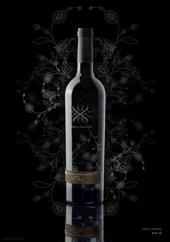
Description
In creating this new brand, we needed to express that Korbin Kameron is a boutique wine with modern sensibilities. The simplicity of the packaging sets it apart from more traditional approaches to wine labeling, yet still provides a sense of modern elegance and sophistication for these limited-production vintages. The Korbin Kameron wine identity was created as a modern interpretation of grapevine tendrils. The free-form yet geometric nature of the tendrils is analogous to the art and science aspects of wine making.
Juror Notes
“Elegant, classic, smart use of base bottle graphics for all wines, plus label to indicate variety and vintage.”
“Very smart materials used to put the core brand identity on the bottle, the year and variety on the sticker. Looks intrinsically Californian, which it is.”
Credits
- Design firm
- Office
- Creative director
- Jason Schulte
- Designer
- Jason Schulte
- Printing method
- Silkscreen, offset, foil stamp
- Typefaces
- Filosofia, Trade Gothic
- Client
- Mitchell Ming (Moonridge Vineyards)