FF Unit Typeface
United Designers Network, Berlin, Germany, 2003
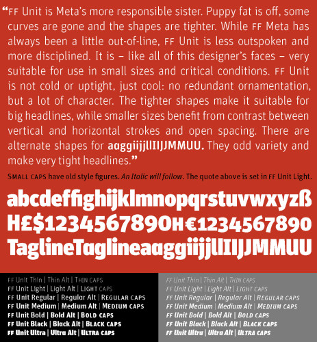
Description
The design challenge was to create a new typeface family for corporate clients that would have enough character to look different, but not so much as to be vain. The typeface would need to be legible at small sizes, but with heavy weights for headlines. Alternate characters would allow for variations and tight setting.
We created sufficient weights to meet all of a designer’s needs and added some trademark Spiekermann traits to distinguish it from 30,000 other fonts on the market.
Within three months of the launch, almost 1,000 units were shipped. For a new font, that is sensational. Normally, not more than a dozen of these large families are sold per month.
Juror Notes
This is great, very versatile. Very crisp and stays crisp and clean even when small. The letter substitutions are great.
Credits
- Design firm
- United Designers Network
- Creative director
- Erik Spiekermann
- Designer
- Christian Schwartz
- Client
- FontShop