

Pazzo Wine label
CF Napa, Napa, California, 2003
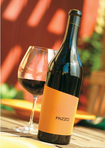
Description
Pazzo comes from a small, family-owned winery in the Napa Valley that specializes in distinct proprietary red wines. It is a high-quality, fruit-forward Sangiovese blend described by its winemaker as “spirited” and “unpretentious.” To capture the wine’s lively character, the label needed to be irreverently fun, yet palatable, and appeal to a traditionally younger wine consumer as an approachable alternative to conservative wine labels. Drawing from its Italian varietal base, we named it Pazzo, which translates to “crazy” in Italian. The design solution uses a vibrant color palette, jarring pattern, hand-drawn typography and unexpected skewed angles on the label and neckband to create shelf impact while remaining simple and casual.
The response has been very positive. Initially intended for primary sales at specialty wine shops, the brand has garnered a cult-like following and can now be found in some of California’s finest restaurants. With the new label design, Pazzo has met increasing demand to ten times its annual case production, enabling the company to sell future vintages well in advance of their production.
Juror Notes
Fun and sphisticated at the sme time, very appropriate for the product. The details are beautiful: the P, the orange bottle top, the fact that everything is off-center; even the back label is funny! The execution is excellent.
Credits
- Design firm
- CF Napa
- Creative director
- David Schuemann
- Art director
- David Schuemann
- Photographer
- Dan Mills Productions
- Printer
- Cameo Crafts Graphic Industries Limited
- Printing method
- Offset lithography
- Typeface
- Hand drawn
- Client
- Bacio Divino