Retina typeface family
Hoefler & Frere-Jones, New York, New York, 2002
Description
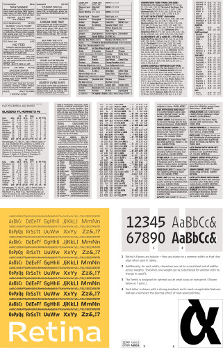
Retina began as a new typeface for stock listings, commissioned by The Wall Street Journal for higher copyfit (to save paper) and greater legibility (to accommodate an aging readership). Drawn for seven point and smaller, Retina dispenses with traditional ideas of letterforms and instead takes its shape directly from what the eye needs, and what the brain expects, at very small sizes. Increments of weight are finer than usual, so that the relation of “light” to “bold” can be tuned to the content and structure of the page. With all weights having the same copyfit, they can also be substituted for one another to anticipate press behavior. Notches cut into the letterforms further counteract the “bleeding” effect of ink on newsprint. The family was recently expanded to include wider versions for box scores, classified ads and other small matter.
Credits
- Design firm
- Hoefler & Frere-Jones
- Designer
- Tobias Frere-Jones
- Client
- <em>The Wall Street Journal</em>