

Archer typeface family
Hoefler & Frere-Jones, New York, New York, 2002
Description
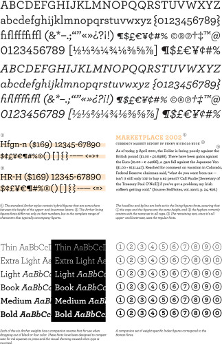
Developed for Martha Stewart Living, Archer is a family of 48 original typefaces for text and display designed by Jesse Ragan, Tobias Frere-Jones and Jonathan Hoefler. The goal of the project was to create a family of typefaces that would help Martha Stewart Living maintain a consistent editorial voice over a broad range of designed service pieces that require a number of specialty typographies: recipes, glossaries, instructional charts and diagrams each draw from a unique visual culture, all of which were ingredients in the development of Archer. Archer is that rarest of typefaces, managing to temper the “scientific” associations of the slab serif aesthetic with a welcome note of sentimentality. The result is a typeface that is demonstrably smart and eminently likable.
Credits
- Design firm
- Hoefler & Frere-Jones
- Designers
- Tobias Frere-Jones, Jonathan Hoefler, Jesse Ragan
- Client
- <em>Martha Stewart Living</em> magazine