


Miller High Life
Landor Associates, San Francisco, Milwaukee, Wisconsin, 2010
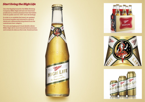
Description
Project brief: Originally launched in 1903, Miller High Life soon became one of the premier high-end beers in the United States and remained so for many years. It was offered in distinctive, clear glass bottles reminiscent of champagne bottles, and was commonly referred to as “the champagne of beers.” The Girl in the Moon illustration and the Miller soft cross logo also became recognized symbols associated with this preeminent American brand.
Despite its iconic nature and having once been Miller Brewing Company’s flagship brand, over time Miller High Life was re-priced and repositioned as a below-premium beer, which resulted in a negative shift in consumer perception. It was time to reinvigorate the premium-beer-without-a-premium-price essence of High Life with a package design that would showcase the brand’s high quality and heritage.
Approach: Given Miller High Life’s heritage, our firm saw an opportunity to celebrate its hundred-plus-year history and make the brand more successful than it had ever been. To improve consumer perceptions, we returned to the brand’s most iconic elements—the soft cross, the proprietary champagne-like bottle, and Girl in the Moon—and contemporized them. By stepping away from traditional below-premium segment semiotics such as ice, heavy gradients and angled type, and simplifying the overall visual expression, we moved Miller High Life into a more premium territory.
Effectiveness: The new packaging and visual identity have allowed the franchise to stretch successfully beyond the below-premium segment, compete against more premium brands and support a higher price point. The new design received an enthusiastic response internally at the 2010 MillerCoors annual distributors conference. It has also been praised externally on design blogs, honored as the second-best identity of 2010 on Brand New and third-best packaging of 2010 on The Dieline.
Juror Notes
We’ll drink to that.
Credits
- Design firm
- Landor Associates, San Francisco
- Creative director
- Tosh Hall
- Designers
- Andy Baron, Tosh Hall
- Illustrator
- Chris Mitchell
- Photographer
- Timothy Hogan
- Project manager
- Jean-Pierre Sabarots
- Client
- MillerCoors