


Sterling type family
Hoefler & Frere-Jones, New York, New York, 2003
Description
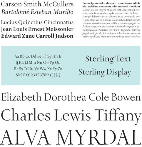
Designed under the direction of Creative Director Karen Silveira for Tiffany & Co.’s grand corporate renovation, Sterling draws inspiration from a multitude of early-twentieth-century inscriptions (including the fascia of Tiffany & Co.’s flagship Fifth Avenue store), spun into a system of seriffed faces for text and display. Sterling employs an elegant and compact system of weights and styles to address a broad range of applications, from newspaper advertisements to online point-of-sale to annual financial statements.
While Sterling is not an adaptation of any specific historical model, the designs owe much to the tradition of British lettercutting first popularized by Edward Johnston at the turn of the twentieth century. Johnston’s work injected a welcome note of modernity into the inscriptional letterforms that had survived since antiquity. His approach has been kept alive in the work of typographer Eric Gill, stonecutter David Kindersley, and most especially engraver Reynolds Stone. A frontispiece engraved by Stone for The Typographic Book inspired the first twelve characters of the Sterling Display Roman typeface, leaving the rest of the face to adhere to or depart from this historical style as it so needed.
Juror Notes
Type design is a craft, and this is wonderfully crafted. Conceptually smart. Nothing groundbreaking but absolutely beautiful. Looks beautiful large. The double “f” ligature is great. Steeped in history and timeless. “I would love to have to use this.”
Credits
- Design firm
- Hoefler & Frere-Jones
- Creative director
- Karen Silveira
- Art directors
- Tobias Frere-Jones, Jonathan Hoefler
- Designer
- Joshua Darden
- Client
- Tiffany & Co.