Jack Lenor Larsen Letterhead
Clouse + Deere, New York, New York, 1995
Description
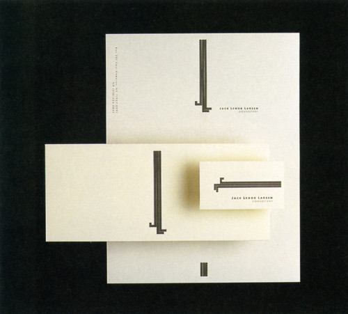
Renowned textile designer Jack Lenor Larsen needed an identity system to promote his consultancy work and to distinguish himself from Jack Lenor Larsen, the corporation. Larsen’s initials were used to create vertically extended letterforms suggesting fiber. The symmetry of composition, especially notable on the envelope, refers to Larsen’s admiration of traditional Eastern crafts. The vertical lines were originally to bleed but Larsen wanted them to stop short of the edges, which in textiles indicates a custom piece, somewhat the opposite of offset lithography. Larsen, a very informed and respectful client, allowed a generous amount of time to explore different concepts which I believe lead to the uniqueness of the final product.
Collections:
Communication Graphics: 17 (1996)
Discipline:
Brand and identity systems design
Format:
Brand and identity systems, Brand identity, Logo, Stationery
Credits
- Design firm
- Clouse + Deere
- Art directors
- Bill Deere, Jack Lenor Larsen
- Graphic designer
- Bill Deere
- Typographer
- Bill Deere
- Printer
- Karr Graphics
- Paper
- Cranes, Cranes Crest Natural White, Wove Finish, sub 28
- Client
- Jack Lenor Larsen
Loading...
Loading...