


BP Amoco Merger identity system
Landor Associates, San Francisco, California, 2000
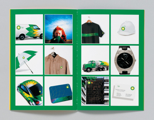
Description
British Petroleum (BP) and Amoco merged in 1998 to form BP Amoco, which went on to acquire ARCO and Burmah Castrol. We recommended that BP be the name of the newly merged company: bold people, better products, big picture, beyond petroleum. The lowercase logotype makes a break from the past and is more modern, open and friendly. We also developed a symbol that communicated BP’s commitment to environmental leadership and the development of alternative energies. The Helios mark reflects BP’s determination to create products and services that respect human rights and the natural environment. The interlocking parts of the Helios mark form one vibrant whole, symbolizing the collective power of the individual companies coming together. The symbol also resembles the sun, a priority in BP’s search for new sources of energy.
Credits
- Design firm
- Landor Associates
- Creative directors
- Margaret Youngblood, Nancy Hoefig, Courtney Reeser
- Senior brand strategist
- Peter Harleman
- Design director, environments
- David Zapata
- Design director, interactive
- Brad Scott
- Designers
- Cynthia Murnane, Todd True, Frank Mueller, Michele Berry, Cameron Imani, Ivan Thelin, Ladd Woodland, Maria Wenzel
- Writers
- Jane Bailey, Susan Manning
- Account director, Interactive
- Wendy Gold
- Project management
- Greg Barnell, Stephen Lapaz, Bryan Vincent
- Realization
- Russell DeHaven
- Client
- BP Amoco