American Poets Project
Mark Melnick Graphic Design, New York, New York, 2003
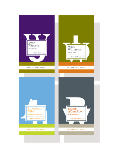
Description
The Library of America was interested in starting a new series concerned strictly with American poets. The volumes would be either the works of a single poet (Whitman, Shapiro, Poe, and so on), or else thematic anthologies (humorous poetry, poets who served in World War II, etc.). Each volume would be under 250 pages and reasonably small in size. The Library of America also asked that the books be clearly differentiated, visually, from the rest of their list, which is primarily black, with white script type and a gray-scale photograph. Given that the audience for books themselves is small, and the audience for poetry a small fraction of that, we just wanted to get people’s attention. If they were in the mood for reading some American poetry, we’d be in luck. Aside from these concerns, I was given no other stipulations for the design.
Mostly, I wanted to do something that took full advantage of the free rein I was given, because that doesn’t come around too often. Everyone involved had no preconceptions of what this whole thing should look like, and Library of America was very interested in getting something that didn’t look like every other series out there. I did two earlier designs that were far more traditional and conservative—this was my third—and LOA approved it immediately, without a single alteration.
The title of the series, The American Poets Project, drove a lot of my decisions regarding the solution. I couldn’t help thinking, with a series title like that, of the Works Progress Administration (WPA), and all the posters generated around that time to tout America. It just had a workmanlike feel to it, and the solution had to have the same: something bold, something elemental, something solid. No needless flourishes or dingbats or pretty stuff. I was also thinking of how the best poetry creates clear, concrete images in the reader’s mind, essentially sculptures made of words, and so wanted something sculptural on the cover to hint at that solidity.
Since the project is still ongoing (six to eight titles a year), and since it is, after all, poetry, something that simply can’t be judged by typical standards of financial success, return on investment is a bit hard to evaluate. I guess the fact that it’s still ongoing after two years, without a tremendous amount of advertising, is as good an indicator as any that it’s been reasonably successful. Ultimately, it was successful (in my opinion) because the process was undiluted and unencumbered by the typical annoyances that surround most publishing ventures—everyone involved was simply looking to put something out there they could be proud of. No one was penny-pinching, no one was second-guessing every little aspect; it was a joy all around.
Juror Notes
“Bold and forward use of colors and type in an exaggerated vertical format that supports the verse inside without overwhelming with ‘design’.” Jack Woody
Credits
- Design firm
- Mark Melnick Graphic Design
- Creative director
- Chip Kidd
- Designer
- Mark Melnick
- Jacket designer
- Mark Melnick
- Production directors
- Sharon Graham, David Cloyce Smith
- Publisher
- The Library of America
- Trim size
- 4.75 x 7.75”
- Compositor
- DBS (Dedicated Business Services)
- Typefaces
- Ionic MT, Twentieth Century MT
- Jacket printer
- Malloy
- Book type
- Literature and nonfiction