

WABC-TV, poster, preview invitation, poster, button, acceptance card and shirt design
Delia Femina, Travisano & Partners Inc., 1971
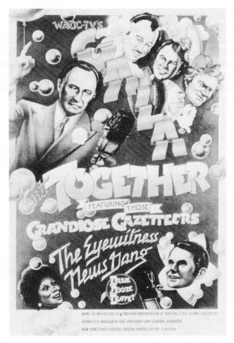
Description
Juror Notes
As one who worked for four years in the 1940's as a
Sho-Card letterer for a commercial artist, I can't resist this
poster. What you see here is the 1942 Speedball Lettering
Textbook entering Airbrush Heaven (plus some quite good
likenesses). The whole thing is frankly nostalgic in style—or,
to put it another way, it parodies an outmoded style; as did
many, many entries in the show. I wonder how many
artists, designers and art directors are conscious of their
own motivation when they take this route. Their real
strategy, usually hidden even to themselves, is this; In using
an obviously dated style, one is being ironic or, at worst,
camp. Therefore, through such a style one can express a
sentimental, simple-minded or otherwise unfashionable
emotion (such as "Gee! Let's have some fun!") without
appearing naive. The underlying statement is: "See? I'm not
being corny—I'm being camp." It's a way of expressing a
nice blowsy emotion—while remaining hip.
Many people in the media, to please themselves as well
as their customers, I suspect, now feel an urge to project
happiness in the face of all of the troubles of the times-
without sacrificing hipness. For example, women buy
Vogue and Harper's Bazaar for two reasons: (1) the clothes;
(2) the happiness. Everything remains very happy in these
magazines, full of fun; no long faces. As the times got worse
in the late '60s and in 1970, these magazines responded by
having the models smile more and kick up their heels.
Literally. There is so much incredible grinning, laughing,
screaming, kicking, jumping, skipping and hopping in the
pictures in these magazines, there is no way to tell the
actual shape of the dresses. But this has been a sub-
conscious strategy among all concerned. Consciously, the
editors keep telling themselves and their staffs: "This year .
we're going to get serious. We're going to put some teeth in
this book!" And so on.
A familiar bygone style tends, in itself, to create
happiness, because people tend to remember the past as
having been happier than the present. Doctors (not just
psychiatrists) run into this phenomenon continually and
have a name for it: "The Old Oaken Bucket Delusion."
Happier? Even the 1940's? Especially the 1940's. It is
neither fashionable nor hip to look back upon war as a
happy time, but in fact the War of 1941-45 was an insanely
happy time in America. Morale and incomes shot way up.
Everyone was a happy hawk. It would be difficult today to
exploit the happiness of that war in print—but in graphics
it's a piece of cake.
-Tom Wolfe
Credits
- Design firm
- Delia Femina, Travisano & Partners Inc.
- Art directors
- James Perretti, Mary Ann Onorato
- Designers
- James Perretti, Mary Ann Onorato
- Artist
- Charles White III
- Client
- American Broadcasting Company, WABC-TV