


Dada
National Gallery of Art, Landover, Maryland, 2005
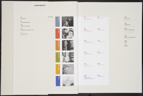
Description
The design challenge for the Dada catalog was to clearly present the diverse content that includes six illustrated essays and more than 400 works by 46 artists from six cities over 13 years. The “Chronology” section tracks Dada and related events in the six cities, aligning this information as it occurred from 1911 through 1926. The grid for the catalog, which is 28 squares—four columns by seven rows—per page grew out of this section. This grid provides the ideal balance of structure and flexibility throughout. The essays, plates and chronology are arranged by the six cities; the films and bibliographies have city references. Each chapter, essay, work of art and city reference is signified by the city color. The respective colors also print on the fore-edge of the corresponding city chapters, creating navigational tabs.
The Dada catalog’s formal structure and rhythm recognizes the dadaists’ use of asymmetry, contrast, overlap and transparency. The text font is Quadraat, a versatile and legible face; the display font is Grotesque, used by the dadaists in a myriad of styles from ultra-condensed to expanded. The composition acknowledges the Dada artists’ unconventional mindset with a bit of the unexpected.
Juror Notes
This is what an art book should be: big, comprehensive, authoritative, typographically responsible and well designed.
Credits
- Design firm
- National Gallery of Art
- Design manager
- Margaret Bauer
- Designer
- Daphne Geismar
- Jacket designer
- Daphne Geismar
- Production manager
- Chris Vogel
- Authors
- Leah Dickerman, Dorothea Dietrich, Brigid Doherty, Sabine T. Kriebel, Janine Mileaf, Michael R. Taylor, Matthew Witkovsky
- Editor
- Karen Sagstetter
- Trim size
- 8.5 x 12 inches
- Pages
- 536
- Quantity printed
- 33,050
- Compositor
- Amy Storm
- Typefaces
- Quadraat, Monotype Grotesque
- Printers
- Grafisches Zentrum Drucktechnik (Germany), Ditzingen-Heimerdingen (Germany)
- Jacket printers
- Grafisches Zentrum Drucktechnik (Germany), Ditzingen-Heimerdingen (Germany)
- Paper
- 150 gsm Dacostern
- Binder
- Grafisches Zentrum Drucktechnik
- Binding method
- Symth sewn
- Publishers/clients
- National Gallery of Art, D.A.P