


Martha Stewart Everyday, a case study
Doyle Partners, New York, New York, 2000
Description
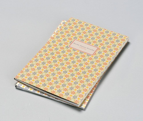
The mission was to create a visual identity and cohesive packaging program for thousands of products made by hundreds of vendors that explains the product assortment, highlights the beautiful product design and is “magnetic” to shoppers in Kmart’s mass-market environment. The Martha Stewart Everyday design program is comprised of a simple logo and an overall clarity that is synonymous with Martha Stewart’s brand, all delivered in a wide assortment of bold colors and accessible type. Packaging was constructed to highlight the product attributes, allowing light to shine through the glassware packages, letting customers feel the weight of flatware or even presenting uninterrupted surfaces of plates in a subtle range of colors. The sheer volume of the Kmart housewares department allows numerous 40-foot runs of products, a branding reinforcement unsurpassed in the industry.
Credits
- Design firm
- Doyle Partners
- Creative director
- Stephen Doyle
- Designers
- Tom Kluepfel, Rosemarie Turk, Lisa Yee, Ariel Apte, Vivian Ghazarian, John Clifford, Liz Ahrens, Gratia Gast, Michelle Cosentino, Jia Hwang, Craig Clark, Naomi Mizusaki, Lizzy Lee, Vanessa Eckstein
- Project managers
- Cameron Mannin, Goizalde Mintegia
- Clients
- Kmart, Martha Stewart Living Omnimedia