


Marcel Duchamp-Man Ray: 50 Years of Alchemy
Greenberg Kingsley, New York, New York, 2004
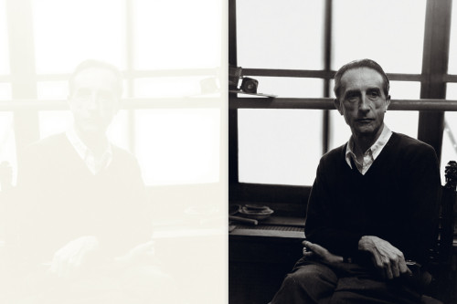
Description
The book is an exhibition catalog of a gallery show—featuring documentation of Marcel Duchamp's last work, previously unknown—that occurred four years earlier. To convey the spirit of Duchamp and Man Ray's work, overcome the passage of time between exhibit and catalog, and underscore the material's scholarly significance, we chose to make the piece a “collectible.” Typefaces were chosen from those first designed in 1915, the year Duchamp and Man Ray met. The tinted varnish that “reflects” the essays is a reference to a (possibly apocryphal) Duchamp aphorism, and his concepts of “duality,” “infra-thin,” and “spontaneous reproduction.” The front cover's die-cut hole echoes Duchamp's Given: 1. The Waterfall, 2. The Illuminating Gas (Etant Donnés). And in the special edition, Duchamp and Man Ray's first and last collaborations have been hidden under a layer of scratch-off ink-an homage to Elevage de Poussière (Dust Breeding). Only by breeding dust (and partially destroying the edition) can the images be revealed. Many of the catalog's images were 4-by-5-inch chromes of the work as it hung in the exhibition. The lens distortion and small size of each work in the frame prevented us from presenting nicely silhouetted individual images, and each piece had been returned to its owner years before. So we printed the chromes full frame and silhouetted only the images we had of individual works. The reflecting tinted varnish was a method of stretching out the material to a proper book size. We were lucky that it had resonance with the subject matter. When the concept was presented to the client, he excitedly had his art handler retrieve the Duchamp multiple known as Box-in-Valise (Boîte-en-Valise). In it was an obscure work done in varnish over a reproduction of his bicycle wheel/bar stool readymade.
Credits
- Design firm
- Greenberg Kingsley
- Art director/designer
- D. Mark Kingsley
- Jacket designer
- D. Mark Kingsley
- Picture editor
- Sean Kelly
- Authors
- Chrissie Iles, Sean Kelly
- Editor
- Julia Bloch
- Publisher
- Sean Kelly Gallery
- Trim size
- 6 x 8 inches
- Pages
- 128
- Quantity printed
- 2,250; special edition of 26 with 7 artist proofs
- Compositor
- D. Mark Kingsley
- Typefaces
- Goudy Old style, London Underground by P22 (after Edward Johnston). Both fonts designed in 1915, the year Duchamp and Man Ray first met.
- Printer/binder
- Oceanic Graphic Printing
- Jacket printer
- Oceanic Graphic Printing
- Binding method
- Smyth sewn case binding