Opolis ID
Opolis Design, Portland, Oregon, 2005
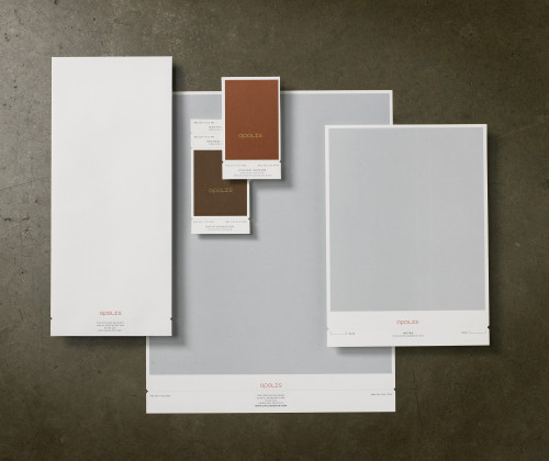
Description
Our intent was not to create a portfolio of printing techniques, but that is essentially what we did. We set out to design a system that was visually very simple, yet had a lot of character on further inspection. We accomplished this through the use of a variety of printing techniques. We engraved the logo over a litho-printed color field, letterpress-printed the text, and then added die-cut notches and a perf that allows you to tear off a tab containing the contact information of any one of the three members of the team.
Clients are impressed when we hand them the card, but we can’t help but wonder if they would be just as impressed if we wrote our number on a dollar bill. It might have been a cheaper way to make a good first impression.
Juror Notes
Typography is beautiful. Restrained—there’s a lot of detail but also high sophistication.
Textural and very nicely done. Very appropriate. The perforations are very nice.
Very digital treatment in the name, contrasted by the highly tactile and detailed production.
Credits
- Design firm
- Opolis Design
- Creative directors
- Dan Richards, Michael Verdine
- Art director
- Michael Verdine
- Designer
- Michael Verdine
- Producer
- Kathy Middleton
- Project manager
- Kathy Middleton
- Printer
- Premier Press
- Printing method
- Litho, letterpress, engraved
- Paper
- Strathmore wove, recycled soft white
- Client
- Opolis