


Mohawk identity system
Pentagram, Aurora Design, New York, New York, 2002
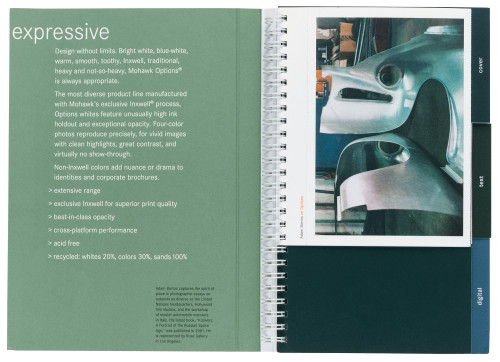
Description
In 1991, Pentagram designed an identity for Mohawk that utilized traditional elements to signify the quality of its paper. Mohawk later expanded into papers for color digital printing, and marketed this line using a separate symbol. Quickly, however, it became clear that Mohawk needed to use one voice to speak to both aspects of its business. Pentagram was asked to redesign the Mohawk identity with a view to providing a more contemporary interpretation of the brand, but one that was rooted in its past. The new signature is based on the typeface Metro, originally drawn by the great American designer William Addison Dwiggins.
Collections:
AIGA 365: 24 (2003)
Repository:
Denver Art Museum
Discipline:
Brand and identity systems design
Format:
Brand and identity systems, Brand identity, Brochure, Business card, Corporate communication, Logo, Package, Stationery, Booklet
Credits
- Design firms
- Pentagram, Aurora Design
- Designers
- Michael Bierut (Pentagram Design), Abbott Miller (Pentagram Design), Jennifer Wilkerson (Aurora Design)
- Photographers
- Adam Bartos, Lynn Geesaman, Anna Hammond, Robert Polidori
- Typefaces
- Corporate S, Metro
- Printers
- Dynagraf, George Rice and Sons, Hennegan, Williamson Printing
- Papers
- Mohawk Navajo, Mohawk Superfine, Mohawk Options, Mohawk Satin 2.0
- Client
- Mohawk Paper Mills
Loading...
Loading...