Flux Restaurant identity
Korn Design, Boston, Massachusetts, 2002
Description
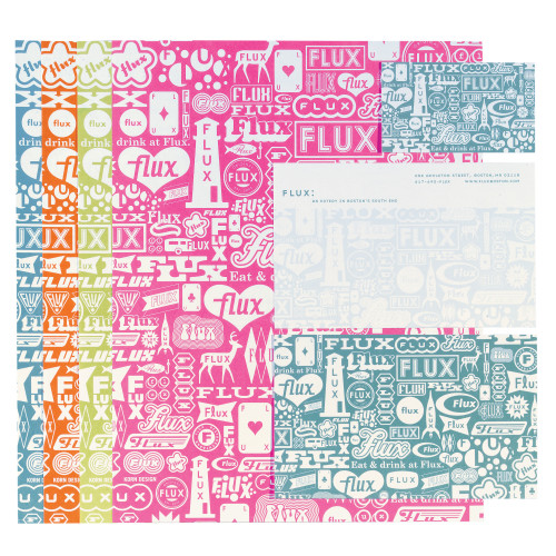
Flux is a hip new restaurant—inexpensive and fun in an equally hip neighborhood of overpriced restaurants. This “nonidentity” builds on the definition of the name “Flux”—constant or frequent change—allowing it to stand out and relate to its customers, whatever their mood. Our signage included the use of an innovative technique, normally used for race-car graphics, to apply the complex pattern of logos onto the glass entrance door. Printed items use one ink color. We used off-the-shelf plastic sleeves for the menus to keep production costs low. The menus, napkins, straws and other accent items throughout the restaurant change color with every season.
Collections:
AIGA 365: 24 (2003)
Discipline:
Brand and identity systems design
Format:
Brand identity, Signage, Stationery, Menu
Credits
- Design firm
- Korn Design
- Creative director
- Denise Korn
- Designer
- Javier Cortés
- Illustrator
- Javier Cortés
- Typefaces
- American Typewriter, Base 9, Bell Bottom, Century Schoolbook, Cooper Black, Dogma, Futura, Interstate, Solex, Suburban, Vitrina
- Printer
- Ink Spot
- Paper
- Weyerhaeuser Cougar White 100 lb. Cover and 80 lb. Text Smooth
- Client
- Flux Restaurant
Loading...
Loading...