


Workspring Identity
Studio/lab, Chicago, Illinois, 2009
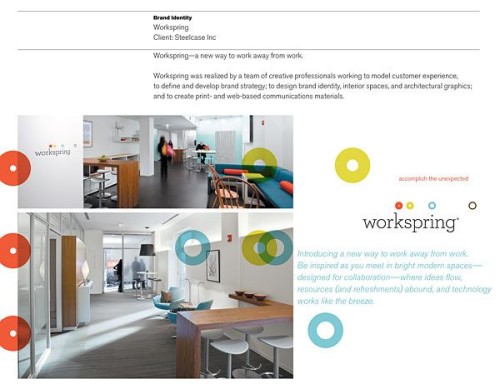
Description
Workspring was imagined by a team of work-experience experts at Steelcase as a network of collaborative meeting rooms designed to inspire and support creative process, productive retreat and transformative exchange. A complete brand strategy and identity were created by Studio/lab in collaboration with Steelcase Workspace Futures.
Verbal tools: words and statements that enable us to share an understanding of what Workspring is and to create and manage awareness.
Visual tools: symbols, typefaces, colors, patterns and images, used creatively and consistently to communicate visual ideas about Workspring.
Branded items: visual and verbal brand tools that come to life in marketing materials (business papers, communications, advertising, promotions and gifts).
The environment: the brand identity on-site—where the color palette is in perfect balance, where the elements of the visual identity form large-scale information graphics and where the details of how people work are thoughtfully enhanced with custom-designed collaborative tools.
Juror Notes
Very creative and smart uses of logo elements to create patterns and influence product and environmental design. Great branding consistency and integration. Well designed.
This really worked as a system, each component standing on its own yet integrating with the whole.
Credits
- Design firm
- Studio/lab
- Creative director
- Marcia Lausen
- Designers
- Tara Kennedy, Meeyoung Melamed, Jody Work
- Photographer
- Tim Wilson
- Writers
- Marcia Lausen , Trysh Wahlig
- Research
- Trysh Wahlig
- Client
- Steelcase, Inc.
- Art director
- Tara Kennedy