


Fashion Show Food Court identity
Sussman/Prejza & Co., Inc., Culver City, California, 2003
Description
In Las Vegas, it’s not easy to attract attention. Neon, strobe lights, large video screens and enormous hotels are all vying nonstop to be noticed. Fashion Show Las Vegas, a large-scale retail development, however, is visible by contrast, using clean lines and advanced technology for its design. Because of the project’s massive size, two million square feet, the client soon discovered that attracting visitors to the top-level food court would be challenging. Their target market included not only shoppers within Fashion Show but pedestrians on Las Vegas Boulevard who could be attracted to the dining options if they became aware of them.
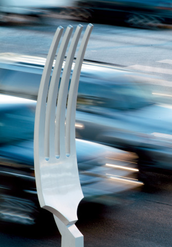
Sussman/Prejza’s original brand identity and environmental graphics for Fashion Show make reference to two classic style icons: the simple black-and-white Chanel No. 5 box and the elegant Didot logo of Vogue magazine. The purity of black and white functions well as a neutral envelope for the colorful tenant activity inherent in a shopping environment. For the food court, it was decided that a similar elegant simplicity should be pursued to coordinate with the existing environment. A tactical decision was to use iconography as the “draw” and text only at more personal levels along the pedestrian path. Our “breadcrumbs” took the form of everyday items synonymous with epicurean activities, including spoons, knives and forks. Several of the utensils are paired with a “menu” that directs pedestrians to food establishments throughout the shopping center.
Convincing the client of the necessity of producing 25 large-scale sculptures to “sign” the food court and its paths was a challenge, especially in light of budgetary constraints. But eventually we all came to agree that in Las Vegas, size matters, and it would be even more important to the success of this program to guide pedestrians.
Near the end, installation logistics proved to be the most tricky. Installing an 1,800-pound “plate” on the fourth floor of a completed glass fascia was an almost insurmountable challenge. Structural anchoring issues relating to underground parking required engineering talent to resolve the placement of giant utensils at street level.
After all the elements were finally mounted or hung successfully, the public noticed almost immediately. A month after installation, the upper-level food court entrance became the busiest pedestrian entry/exit of the entire project, a fact recorded by electronic tracking machines that showed a four-fold increase in food traffic. The tenants of the previously ignored food court, and by extension the client, were extremely happy with the change.
Juror Notes
Scale is fun, stands out for its simplicity. Clean design—surprising for Vegas. The designers weren’t afraid to be obvious. They took the common and made it uncommon, I always find magic in that.
Credits
- Design firm
- Sussman/Prejza & Co., Inc.
- Creative director
- Deborah Sussman
- Art director
- Sam Fidler
- Designers
- Sharon Blair, Jenn Chan
- Photographer
- Jim Simmons
- Production artist
- Paula Loh
- Fabricator
- Casino Lighting and Sign
- Typefaces
- Agenda, Joanna MT Italic, Trade Gothic Condensed No. 18
- Client
- The Rouse Company