


KNOCK identity - Self Awareness
KNOCK, Inc., Minneapolis, Minnesota, 2009
Description
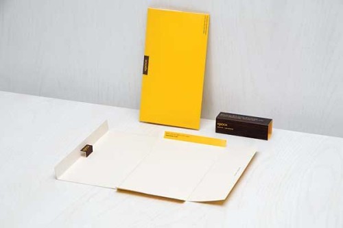
The KNOCK identity system reflects the attention to detail and innovation for which they are known. Surprise elements abound throughout each identity piece. Each KNOCK business card pops out into a geometric, wood-grained identification log. Inside, each card is printed with a personal image created by each employee. KNOCK’s letterhead becomes its own envelope, able to run through any printer or serve as a handwritten note in a self-contained, post-worthy package. The KNOCK notebook, covered in a beautiful wood-grain texture, featuring a golden KNOCK logo with hexagonal-grid pages and hidden stickers inside, is enough to make any client take notes.
Juror Notes
Pop-ups, sticker sheets and a punny paper choice! Oh my! It’s the identity that’s got it all. This has so much enthusiasm. Who could resist?
Great creative play on the texture and 3-D foldability of the business card and envelope.
I love the choice of including a set of stickers with the notepad. And the grid pattern of the pages.
Credits
- Design firm
- KNOCK, Inc.
- Creative director
- Todd Paulson
- Designer
- Meenal Patel
- Illustrator
- Dan Black
- Production artist
- Creighton King
- Printer
- Impressions Incorporated
- Client
- KNOCK, Inc.