The Coast of Akron
Farrar, Straus and Giroux, New York, New York, 2004
Description
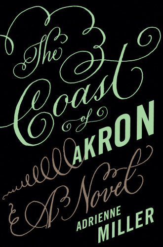
I needed to create a “big book” look, while keeping it literary, for a debut work of fiction by a prominent member of the literary community. This book is about an atypical American family living a lush, expensive, dramatic, hilarious life. The design needed to distinguish the book from other midwestern novels—no generic photos of sprawling flat landscapes with simple type. The title (obviously) helps in this regard, but the design needed to reinforce this separation from other American novels.
Fergus, the main drama queen, becomes obsessed with a lavish party he is throwing for the midwestern glitterati—a party where his delusions of grandeur prove disastrous. I thought calligraphy in unconventional colors would be perfect, to echo an invitation and to give lots of pizzazz to the words, in contrast to what one typically thinks of as simple, boring Akron, Ohio. I also wanted to inject some drama with the black background and the tornado-like flourish.
Credits
- Design firm
- Farrar, Straus and Giroux
- Art director
- Susan Mitchell
- Jacket designer
- Lynn Buckley
- Calligrapher
- Chi Nguyen
- Production director
- Tom Consiglio
- Production coordinator
- Michelle Crehan
- Author
- Adrienne Miller
- Editor
- Eric Chinski
- Publisher
- Farrar, Straus and Giroux
- Trim size
- 6 x 9 inches
- Quantity printed
- 20,000 (first printing)
- Typeface
- Trade Gothic (customized) and calligraphy by Chi Nguyen
- Jacket printer
- Phoenix Color
- Paper
- Phoenix supplied paper–white, 80 lb. c/1/s; matte film laminated finish