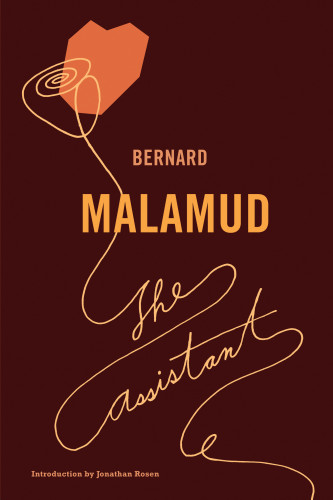
Malamud series
Farrar, Straus and Giroux, New York, New York, 2003
Description
The project entailed designing covers for a series of literary fiction titles by an author whose most successful books were first published in the 1950s and 60s. The series needed to look cohesive, with each cover able to stand on its own. The purpose of reissuing any series in paperback with a fresh new look and with new introductions by younger writers is to appeal to younger readers who may be unfamiliar with an important author such as Malamud. One design problem in repackaging Malamud’s work is appealing to a younger audience’s aesthetic sensibility without turning off traditional readers of Malamud who may want to reexamine his work. I also needed to find a design solution that would reflect Malamud’s writing, which is spare, but also emotional and metaphorical.
I researched design from the 50s and 60s, read all the books, and researched the author.
For the final solution, I hand-lettered each title in a similar style, chose colors that complemented the mood of each book, and used some sort of blocky, cut-out shape to add interest and a metaphor to the design while keeping to the design style of the 50s and 60s.
Many young people have told me that they have read Malamud for the first time because they were attracted to these designs. This, of course, is the ultimate goal!
Juror Notes
“The simplicity of the graphics evokes an earlier time and sensibility that translates easily into our congested present.” Jack Woody
Credits
- Design firm
- Farrar, Straus and Giroux
- Art director
- Lynn Buckley
- Jacket designer
- Lynn Buckley
- Illustrator
- Lynn Buckley
- Production director
- Giraud Lorber
- Author
- Bernard Malamud
- Editor
- Paul Elie
- Publisher
- Farrar, Straus and Giroux
- Trim size
- 51/2 by 81/4”
- Typefaces
- Hand lettering, Rockwell, Trade Gothic
- Jacket printer
- Phoenix Color Corp.
- Book type
- Literature and nonfiction


