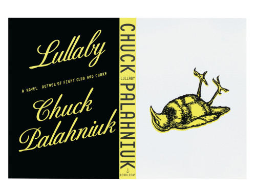
Lullaby cover
Rodrigo Corral Design, New York, New York, 2002
Description
Chuck Palahniuk’s dark and bizarre novel explores issues of death, society, information and power. It deals with anger and love, and with the sudden death of children. With such topics, it was important that the cover image stay within certain boundaries. To put a dead child or a storybook on the cover just wouldn’t fly: one risks saying too much, the other, not enough, and both would have lost Palahniuk’s signature black humor. However, the use of a symbol can evoke many different but intertwining themes.
The image of the dead bird acts more as a symbol for the book’s issues than as an illustration of them. It also allows the reader to draw his own conclusions. Judy Lanfredi’s bird illustration conveys the death of an innocent creature, silence, and even a twisted sort of humor—all ideas that come across in Lullaby. The quality of the illustration also calls to mind a child’s picture book—one of Aesop’s many fowl tales, or that of poor Cock Robin. Perhaps the most striking thing about the cover is the lack of type. This treatment further intensifies the solitary image, the need to draw conclusions, and the silence of the dead.
Credits
- Design firm
- Rodrigo Corral Design
- Creative director
- John Fontana
- Art director
- Rodrigo Corral
- Designer
- Rodrigo Corral
- Illustrator
- Judy Lanfredi
- Trim size
- 5 1/2 x 8 1/4 inches
- Quantity printed
- 120,000
- Jacket designer
- Rodrigo Corral
- Jacket printer
- Coral Graphics
- Author
- Chuck Palahniuk
- Editor
- Gerald Howard
- Publisher
- Doubleday