


CVS Health identity
Siegel+Gale, New York, New York, 2014
Description
In February 2014, CVS Caremark announced that it would become the first pharmacy to take cigarettes out of their stores. The company underscored this public statement by reintroducing themselves as CVS Health, uniting their four service brands—CVS/pharmacy, CVS/caremark, CVS/minuteclinic, and CVS/specialty. Siegel+Gale developed the identity and brand story that would become foundational to how CVS Health distinguishes its role in paving the path to improved healthcare for customers, clients, and communities.
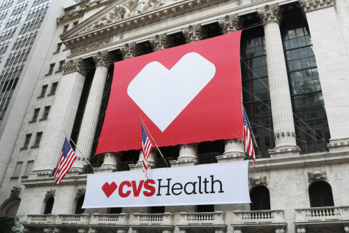
The CVS Health Heart is a bold, sophisticated, and universal symbol that represents the company’s values: integrity, caring, collaboration, innovation, and accountability. In addition to this new logo, we created a library of icons to help simplify complex or abstract ideas across the entire inventory of CVS brand products. Directly influenced by the organization’s purpose, these images can be understood across ages, geographies, and experiences.
Read the full case study with juror comments here: [http://www.aiga.org/cased-2015-winner-cvs-health-identity]
Juror Notes
“In the world of massive corporate branding at a global scale it is nice to see something that has not been totally muddled by committee. CVSHealth is a good example of keeping it simple and tasteful when the design firm can’t steer the client into groundbreaking work—work that sometimes doesn’t make sense. A perfect balance between the expected corporate bore with a little bit of “heart” and whimsy.” —Bryony Gomez-Palacio
Credits
- Design firm
- Siegel+Gale
- Client
- CVS Health