


Chicago 2016
VSA Partners, Inc., Chicago, Illinois, 2009
Description
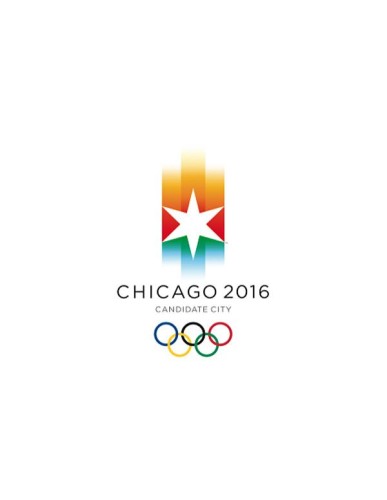
When Mayor Richard M. Daley initiated Chicago’s bid for the 2016 Olympic Games, he assembled a committee of civic, cultural and business leaders. Their challenge to VSA Partners: put the city on a global stage with an aspirational identity and brand strategy that tangibly demonstrates Chicago’s determination to host the 2016 Olympic Games. VSA was assigned the role of defining the brand strategy, visual identity and graphic look and feel for the bid effort, including guidance for other creative partners. VSA developed an identity that served as a tribute to Chicago’s unique physical attributes—a world-class location united by water, green space and architecture. The Chicago 2016 logo blends the colors of the five Olympic rings surrounding the city’s six-pointed star, evoking serene blue lakefront, vibrant green landscape and fiery skyline. It also evokes Chicago’s Games concept: to host compact Olympic Games in the center of the city, along the lakefront and in the city’s parks. In addition to the logo itself, the visual identity was conceived as a system of versatile graphic elements, extending the “painted” look of the Chicago 2016 symbol through brushed colors and athlete photography. These identity elements established the foundation for advertising and communications, providing the design basis for the Chicago 2016 website, event signage, broadcast graphics, clothing and hundreds of visual components used by the bid committee throughout the selection process.
Juror Notes
Rio, shmio. That’s all I’m saying.
Credits
- Design firm
- VSA Partners, Inc.
- Creative directors
- Dana Arnett, Jamie Koval
- Designer
- VSA Partners, Inc.
- Client
- Chicago 2016 Committee