


Salt Lake City Public Library Signage System
Pentagram, New York, New York, 2003
Description
Pentagram created a comprehensive information system and signage program for Salt Lake City’s new Main Library building. Designed by Moshe Safdie & Associates, the building architecture makes the most of its stunning surroundings. Walls of glass provide views of the nearby Wasatch Mountains and a rooftop garden offers 360-degree views of the Salt Lake Valley. Ambitious for a midsize city, the library, with its large public spaces, serves as much as an active community center as it does a repository for books.
The signage system was devised to fit into its information-rich environment in much the same way the building integrates into its surroundings. The design is driven by elements of typography and transparency. Identification signs feature a central mounted word that is bordered by the words “Salt Lake City Public Library” running along the edges in truncated letters, either water-cut from stainless steel, applied in vinyl on clear glass, or reversed out of frosted glass. Graphically, this treatment places the central word within a larger context—like highlighting a single word from lines of a text, or sourcing a piece of information in a library. The half-visible words along the edges appear to be growing from a horizon line, an echo of the identity Pentagram concurrently developed for the Salt Lake City Public Library System.
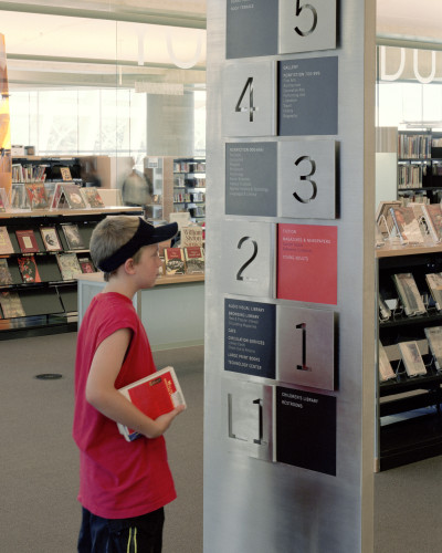
Directional signage in the library stacks uses a template designed to accommodate the Dewey decimal system for cataloguing books. The format allows librarians to easily print and insert signage updates themselves, should they need to adjust the numbers or shelving locations.
Juror Notes
Design didn’t overstate its boundaries. Materials and colors complement the architecture. The colorlessness of the system allows the books to appear warm and human. Can read the words that are cut—but this is our least favorite element.
Credits
- Design firm
- Pentagram
- Art director
- Michael Gericke
- Designers
- Wayne McCutcheon, Lior Vaturi
- Fabricator
- Alotech
- Typeface
- Trade Gothic
- Client
- Salt Lake City Public Library System