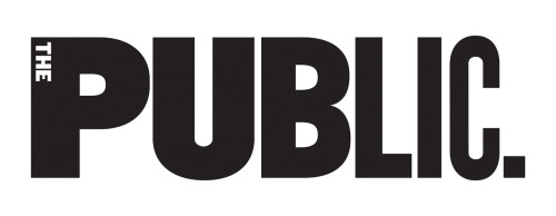
The Public Theater Identity Redesign
Pentagram, New York, New York, 2008
Description
We created our first identity for the Public Theater in 1994, and the identity has evolved over the past 15 years through updates in 2005 and 2008. The new identity was introduced with the campaign for the 2008 Shakespeare in the Park productions of Hamlet and Hair. The letterforms were redrawn using Knockout, and the logo was changed from a vertical to a horizontal orientation, which makes the logo more architectural. The new system utilizes the strict 90—degree angles of a De Stijl—inspired grid, retaining the activity of the original but providing more structure. After 15 years it was clear that the original identity had a lot of power, and while the system cannot return to that original, we can return energy to the form. The identity is a bit like New York itself: constantly evolving.
Juror Notes
Appropriate evolution of a great legacy. There’s a good reason to keep some things and not reinvent.
Credits
- Design firm
- Pentagram
- Art director
- Paula Scher
- Designers
- Lisa Kitschenberg, Paula Scher
- Typeface
- Knockout
- Client
- The Public Theater

