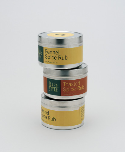
NapaStyle packaging
Pentagram, San Francisco, California, 2000
Description
NapaStyle is a specialty food and lifestyle product line, sold exclusively online and through a catalogue. The products are handcrafted to bring out the richness and quality that is synonymous with California’s Napa Valley. NapaStyle needed to launch its product line as a unique brand in a highly competitive field. The goal was to establish a simple, emotional tie between these products and the customer. The design solution was to create a simple and elegant graphic system that ties together different product categories into a cohesive presentation. The system is flexible enough to work across a variety of unique bottle shapes and containers, allowing the product line to be expanded. We chose a color palette that reflects Napa Valley’s balance of nature, and since the products are sold exclusively through the company catalog and online, we were able to pursue more unconventional packaging solutions.
Credits
- Design firm
- Pentagram
- Art director
- Kit Hinrichs
- Designer
- Erik Schmitt
- Project manager
- Jon Schleuning
- Typeface
- Modified News Gothic
- Printers
- Santa Rosa Label Company, Phoenix Color Corp.
- Client
- NapaStyle


