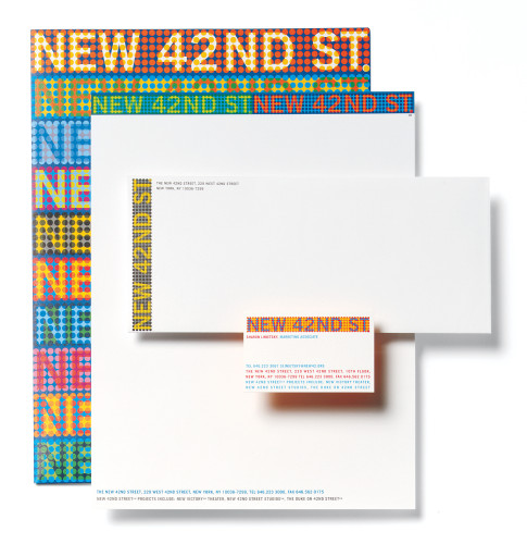
The New 42nd Street identity system
Pentagram, New York, New York, 2001
Description
This identity was created for a non-profit group dedicated to the restoration and reuse of historic theaters and playhouses on New York’s West 42nd Street. The design conveys the color and intensity of Times Square, its marquees and “spectaculars.”
Juror Notes
“I like the fact that it’s a matrix of circles, but they didn’t do the typography out of it. It’s very carefully planned out in terms of overprinting and use of colors.”
“It’s not too pretty. There’s a simple device that’s used in a blunt, straightforward way. It’s restrained but strong. Not too cute or pretty. The palette is somehow surprising. It’s crudely commercial in a tongue-in-cheek way. Garish.”
Collections:
AIGA 365: 23 (2002)
Repository:
Denver Art Museum
Discipline:
Typographic design
Format:
Brand and identity systems
Credits
- Design firm
- Pentagram
- Art director
- Paula Scher
- Designers
- Sean Carmody, Paula Scher
- Typefaces
- Customized, Trade Gothic
- Client
- New 42nd Street Studios
Loading...
Loading...