


Metro Letters: A Typeface for the Twin Cities
University of Minnesota Design Institute, Minneapolis, Minnesota, 2003
Description
Metro Letters: A Typeface for the Twin Cities was produced to document and celebrate the invited competition, jury process and design development phase of Twin, the typeface designed by Holland-based typographers LettError and selected through the Design Institute’s Typeface: Twin Cities competition to design a typeface that would reflect the character of the Twin Cities of Minneapolis and St. Paul. Typographers from the United States and Europe were invited to propose ideas for a typeface that would serve as the house font for the Design Institute’s major event, the Twin Cities Design Celebration 2003.
The book designer, in this case, also served as the author and was therefore able to formulate the editorial and design frameworks together. This conceptual and visual framework were intended to reveal in-depth insight into the process of type design, and allow six young practitioners to explain their working methods through extensive interviews and images of their work.
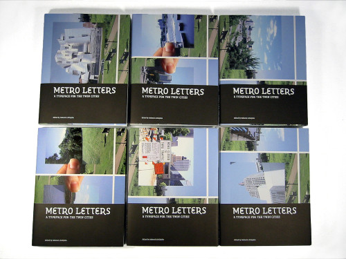
The jacket functions also as a 24 x 36-inch poster depicting different (and well-known) views of the Twin Cities, such as government, city infrastructure, entertainment, architecture, natural environment and culture—the things that make a city memorable. The poster folds down to become the jacket in six configurations, creating six different covers that allow readers to choose their favorite view of the Twin Cities. The contents comprise extensive documentation of the entire type design project, including interviews with all six participating studios, two essays by prominent design educators, a section featuring the selected typeface and design development process of Twin, and full transcripts from the jury debate that include perceptive comments by each jury member.
Conceptual exercises and the messy process of research and development are essential aspects of design that are often overlooked once the final product is produced and distributed. Indeed, the graphic design process is rarely granted space for reflection and critique within the pages of most design publications. Metro Letters exposes the behind-the-scenes process of creating a typeface: how the Design Institute conceived and commissioned a new font, and—with much effort by Erik van Blokland and Just van Rossum—brought Twin to life.
Juror Notes
“Consistent, thoughtful reporting of a typographic experiment. I love the jacket that folds out to a cover (a bit of conceptual art in its own right), the glossary, the readerly yet quietly innovative type, and the typographers documented by the book itself.” Cheryl Towler Weese
Credits
- Design firm
- University of Minnesota Design Institute
- Art director
- Deborah Littlejohn
- Designer
- Deborah Littlejohn
- Jacket designer
- Deborah Littlejohn
- Photographer
- Deborah Littlejohn
- Author
- Deborah Littlejohn
- Editors
- Janet Abrams, Peter Hall, Deborah Littlejohn
- Publisher
- University of Minnesota Design Institute
- Trim size
- 6.5 x 8.5”
- Pages
- 160
- Quantity printed
- 1,500
- Typefaces
- Circuit (Gilles Gavillet and David Rust), Fedra Serif (Peter Bilak), Locator (Eric Olson), Odile (Sibylle Hagmann), Protocol (Conor Mangat), and Twin (Erik van Blokland and Just van Rossum)
- Printer
- Shapco Inc.
- Jacket printer
- Shapco Inc.
- Paper
- Mohawk Options 80# Bright White text and 80# cover
- Binder
- Shapco Inc.
- Binding method
- Perfect
- Book type
- Text