

I Found This Funny
McSweeney’s Publishing, San Francisco, California, 2010
Description
Project brief: Everyone knows Judd Apatow is a comedy genius. He also happens to be super-kind and unbelievably generous. "I Found This Funny" is an anthology of some of Judd's all-time favorite writing. The book is just shy of 500 pages long, contains stories and scripts and essays by nearly 50 different people, and Judd spent about a year putting it all together personally. He spent a long time making the book about ten times better than it needed to be, and he did it all for free. The book was (and still is!) a fundraiser for 826 National, which is a nonprofit tutoring, writing, and publishing organization with locations in eight cities across the country. We wanted to sell a lot of copies of this book so that 826 National could raise a lot of money.
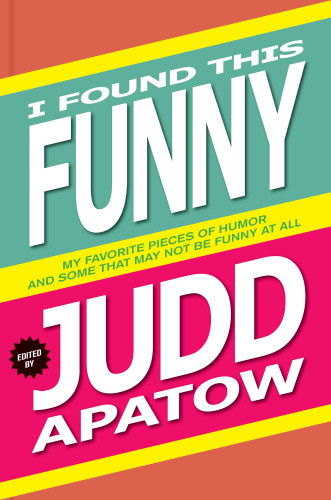
Adrenaline-pumped as we were to be working with Judd Apatow, we started with five or six far-out cover concepts that didn't quite click. All of those early design ideas felt a step too complicated. So we took a deep breath, stepped back, and reminded ourselves about the goals of the project. We knew we needed Judd's name to be big on the cover, and we knew we had to communicate in a split-second that the book is funny. Late at night, in a moment of desperation and too much coffee, we selected "Verdana Bold" from the dropdown font menu in InDesign. It made us laugh, seeing the book's title typeset in 200-point Verdana Bold. Next, we made the JUDD and the FUNNY as big as possible, stretching the type way out of proportion in order to fill every square cm of the cover. Then we added drop shadow — the design's biggest point of contention, among our staff — to make the cover text stand out even more. Each of those design steps felt very nerdy and silly and anxiety-relieving at the time. So did picking pink and teal for the two primary jacket colors and orange for the case. At some point in the design process, we literally picked up a bottle of AJAX off of the restroom floor of a neighborhood taqueria and tried to channel the design spirit of the label on that bottle. One of the last design decisions on this cover was blowing up the barcode on the back cover to a very large size. The barcode is about six inches wide — the full width of the back cover.
Regarding the die-cut, angled jacket: we'd done a few die-cut jackets before, but never one on an angle like this. A couple calls to the printer solidified our confidence that the angled design would work, and so we did it. Someone once likened the shape of the jacket to the shape of a Miss America sash, and that made us smile.
There's a lot of loudness and wildness in this cover, but it was all introduced in an attempt to increase the cover's legibility and clarity.
Effectiveness: Judd was happy. We were happy. We got a lot of nice comments from readers and friends about this cover. A few people have said that the book looks like a Warhol "Brillo" box. That comment feels good and seems nicely in line with our spirit-channeling of the AJAX label at the taqueria. Our all-time favorite quote about this cover came from the distributor. When we sent our distributor the gigantic barcode on the back cover to check out, they said, "It works fine, but I wouldn't go any bigger than this."
Juror Notes
I found this quirky and odd...in a good way! The slanted band is the cover with a giant bar code across the entire back. It’s just right!
Credits
- Design firm
- McSweeney’s Publishing
- Art director
- Brian McMullen
- Designer
- Brian McMullen