GQ Manual Section, Magazine
GQ Magazine, 2007
Description
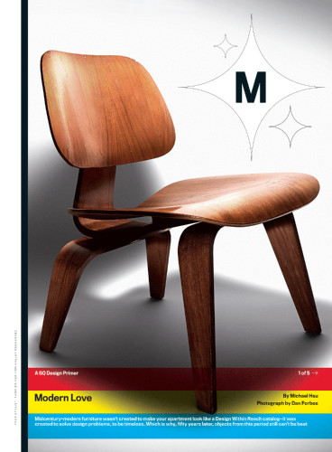
“How would Manual look if it were designed in Excel?” This is the question that was never answered but nevertheless sparked the enthusiasm to limit ourselves to basic colors, simple geometric shapes and a six-column grid in order to communicate instantly the function of a given page in the section.
Juror Notes
Man’s guide to style, gadgets, cinema, etc. Defined system is functional relative to content in each issue. Graphic tabs or icons move reader through content clearly. Flexible, functional excellent hierarchy, attention to typographic details and ornament, sophisticated.
Collections:
AIGA 365: 29 (2008)
Repository:
Denver Art Museum
Discipline:
Editorial design
Format:
Magazine
Credits
- Design firm
- GQ Magazine
- Design director
- Fred Woodward
- Art director
- Anton Ioukhnovets
- Designers
- Delgis Canahuate, Rob Hewitt, Anton Ioukhnovets, Michael Pangilinan
- Picture editors
- Jesse Lee, Justin O’Neill
- Editor
- Adam Rapoport
- Director of photography
- Dora Somosi
- Client
- GQ Magazine
Loading...
Loading...


