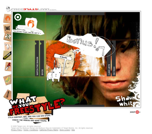
Interactive marketing campaign, Shaun White
Target Interactive Marketing, Minneapolis, Minnesota, 2004
Description
Target Interactive Marketing created the kickfliplivin.com site to offer teen guys exciting, exclusive content and leave the overall feeling, “Target gets me.” Leveraging the talent and personality of action-sports legend Shaun White, Target Advertising created a series of short films on Shaun’s life. Our approach to the site was to showcase the films with visuals, voice, and extras that teens wouldn’t expect from Target, and to drive them to their very own Target.com shopping experience. These webisodes, aired biweekly with limited Target branding, acted as an underground element to the broader mainstream campaign to support the DVD release of The Shaun White Album.
The uniqueness of the Target.com Shaun White Interactive Marketing Campaign was driven by an incredibly speedy and innovative collaboration between web designers/Flash coders, copywriters, film makers, film editors, producers and an illustrator. This partnership produced a fresh, edgy website with related interactive components that drove site traffic and resulted in bottom-line sales in key, related-product categories. Each Target.com Shaun White webisode was filmed, edited and launched online in a matter of weeks, supported by an awareness campaign based on banner ads, CD-ROM giveaway at the X Games, and collaboration with MySpace.com to reach the target audience.
To be relevant and credible with our audience, we needed to tone down our branding and let Shaun speak to the audience. Subtle introductions and uses of the Target bull’s-eye logo were integrated into the design and features, and appeared as the guest explored the site. Copy took a nod from IM’ing speak and used playful spins on everyday language to create a fun and hip navigation system. The site was designed to effectively integrate the content/video updates by placing a large promo on the main page while keeping alternative navigation and exploration in plain sight.
Credits
- Design firm
- Target Interactive Marketing
- Art director
- Ruth Balbach
- Designer
- Todd Steineman
- Illustrations
- PMH
- Editor
- Diane Anderson
- Writer
- Scott Muskin
- Content strategist
- Jill Magaard
- Producer
- Chad Gourley
- Project manager
- Vanessa Holmes
- Client
- Target Marketing Planning, Target Corporation


