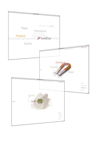
Potlatch Paper website
Pentagram, San Francisco, California, 2001
Description
The Potlatch Paper website, orientated toward the sensibilities of those who work in or around the graphic design industry, makes use graphically of two of the industry’s core tools: type and paper. These elements are used in an innovative, elegant and sometimes whimsical manner as a central part of the site and the site navigation.
Juror Notes
“It’s liberated type. The lack of gimmicks in the interface is refreshing. It’s effortless, like leafing through a book. It’s also useful, not in-your-face.”
“There are some really charming ways of animating typography—like when it becomes magnetic-seeming, sticking to the type. It’s a lovely and sweet idea.”
“There’s a very light touch to it.”
Collections:
AIGA 365: 23 (2002)
Repository:
Denver Art Museum
Discipline:
Typographic design
Format:
Website
Credits
- Design firm
- Pentagram
- Creative director
- Kit Hinrichs
- Designers
- Brian Cox, Brian Jacobs, Douglas McDonald, Holger Struppek
- Animators
- Brian Cox, Brian Jacobs, Douglas McDonald, Matt Rogers, Holger Struppek
- Writer
- Delphine Hirasuna
- Typeface
- News Gothic
- Client
- Potlatch Paper
Loading...
Loading...