


John Fowles
Little, Brown and Company, New York, New York, 2010
Description
Project brief: The publisher wanted to repackage the John Fowles series from our backlist. The previous version of the series had John Fowles’ name very large on the covers and they wanted to make sure that did not change. This was one of the only restrictions that was given to me. The previous series was done sometime in the ’90s, so they wanted a fresh new look.
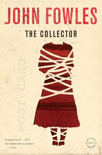
Approach: My concept was to have various illustrators come up with a piece of art that had some resonance with the story. In my search for artists to work on these, things changed a bit. I started coming across pieces that were original works. They fit the story so well I had to use them. For example, The Collector. This was a work of art that already existed in Shannon Freshwater’s portfolio. It was too perfect. It fit the story so well, I had to use it. The same thing happened with Eduardo Recife’s piece for The French Lieutenant’s Woman. Likewise for Nicole Natri’s piece for The Magus.
Effectiveness: The books were not selling the copies that they are currently. The books are really wonderful and they just needed a new package to get readers interested again.
Juror Notes
Rich, evocative, mysterious, compelling. There is an emotional component to these that feels just right.
Credits
- Design firm
- Little, Brown and Company
- Designer
- Keith Hayes
- Illustrators
- Shannon Freshwater, Nicole Natri, Eduardo Recife