


Saastamoisen Säätiö
Kuudes Kerros, Cimiez, Vence, France, 2014
Description
The Saastamoinen Foundation Art Collection is one of the most significant private collections in Finland. The central role of the foundation is to develop and showcase the collection consisting of 2,500 works. Although founded in 1968, the foundation lacked a visual identity. Our task was to design it.
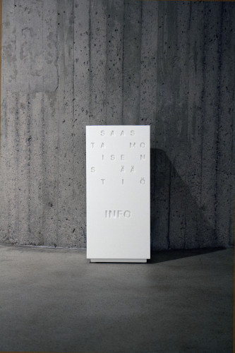
The Saastamoinen Foundation is a renowned authority in the fields of science, culture, and art. Deeply devoted to Finland, the foundation is strongly invested in the country’s future. We designed a visual identity that embodies its international and contemporary scope. The visual identity is inspired by the golden ratio, a divine proportion that often manifests in art, science, architecture, music, and nature.
We created an adaptable logo within the Foundation’s black and white identity that follows the golden ratio. The letters in the logo are not fixed; they can randomly switch places and form abstract combinations. The logo works especially well in animations, where it forms an infinite number of different letter combinations. Because of the logo’s rectangular dimensions and ever-changing combination, the golden ratio template creates beautiful patterns to support the identity.
Read the full case study with juror comments here: [http://www.aiga.org/cased-2015-winner-saastamoisen-saatio-identity]
Juror Notes
“This identity is like a dance, where the use of positive and negative space is traded back and forth in what might seem like chaos but is actually a crafted choreography. It works cohesively from a small piece of paper like a business card, to a museum wall.” —Bryony Gomez-Palacio
Credits
- Designer
- Kuudes Kerros
- Client
- Saastamoisen Säätiö