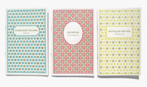
Insurance Editions chapbooks
goodesign, 2004
Description
The client wanted to create a series of chapbooks that look cohesive as a group and distinct on their own. The client would be printing only 250 books and mailing complete sets to a distinguished list of poets. The books are not for sale.
During our initial meeting, the client mentioned that he appreciated the look of “old house dresses, underwear prints, patterns that connote hermitism and quietness.” He wanted something that referenced the traditional without looking old.
The cover is a combination of traditional design elements with a few details incorporated to keep it fresh and new. Based on what the client cited as inspiration for the design, I wanted to create something that had a highbrow/lowbrow quality. I looked for patterns that weren’t too soft but had a strong graphic quality. I paired two new typefaces that reference older type styles—Interstate and Filosofia. The combination of the utilitarian Interstate with the more decorative Filosofia created the plain/pretty balance I was looking for. I used traditional frames and borders to give the covers a formality but chose unexpected, contemporary color combinations to offset them. The final detail that really elevates these covers is the letterpress printing. It connotes craftsmanship that is both skilled and unskilled.
Credits
- Design firm
- goodesign
- Designer
- Diane Shaw
- Editor
- Kostas Anagnopoulos
- Trim size
- 5 1/2 x 8 1/2 inches
- Pages
- 32
- Quantity
- 250
- Typefaces
- Filosofia, Interstate
- Printer
- The Mint Print
- Jacket printer
- Marc Kuykendall
- Papers
- Strathmore Soft White, 24 wove (inside), 88 pasted wove (cover)


