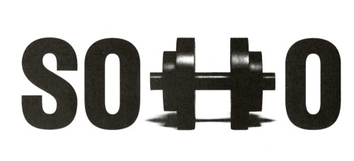
Soho Training Identity
Siegel & Gale, New York, New York, 1993
Description
This logo was conceived as a "signature" that conveys a sense of place and simultaneously communicates the nature of the company's health and fitness business. Hardworking, legible in small sizes, adaptable to horizontal and vertical configurations and to positive and negative applications, the graphic identity succeeds as a communications tool that stimulates interest and invites participation in this downtown New York health club.
Collections:
A Decade of Sports Graphics
Repository:
Denver Art Museum
Discipline:
Brand and identity systems design
Format:
Brand and identity systems, Logo
Credits
- Design firm
- Siegel & Gale
- Art director/designer
- Kenneth R. Cooke
- Illustrator
- Kathy Koelzer
- Client
- Soho Training
Loading...
Loading...