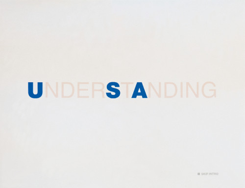
Understanding USA website
R/GA, New York, New York, 2000
Description
R/GA’s challenge was to create an online version of Richard Saul Wurman’s book, Understanding USA. The goal was to develop a site that offers a free downloadable version of the book and was in keeping with the book’s philosophy: “Public Information should be made public.” The experience begins with a quick Flash splash that offers users a symbolic presentation of the book’s premise and introduces them to the navigation’s graphical and color elements. It dissolves quickly into the home page, with the intuitive navigation prominently displayed to the right. The lower-level pages contain a “zoom” feature encouraging visitors to view detailed data. The color-coded, Flash navigation on the home page is mimicked by JavaScript at the top of each ensuing page. Additionally, an interactive site map graphically represents the various sections of the book. Users can rate each page using a simple tool placed globally in the bottom-right corner.
Credits
- Design firm
- R/GA
- Producer
- David Frankfurt
- Art director
- Vincent Lacava
- Interaction designer
- Ted Metcalfe
- Senior designer
- Winston Thomas
- Designers
- Helen Kim, Jean Knapp, Jeff Vock
- Programmer
- Raymond Vasquez
- Managers/quality assurance
- Daniel Harvey, Yamelin Castillo
- Testers
- Diane Lichtman, Ben Oderwald
- Executive producer
- Reven T.C. Wurman
- Principal
- Richard Saul Wurman
- Client
- Richard Saul Wurman


