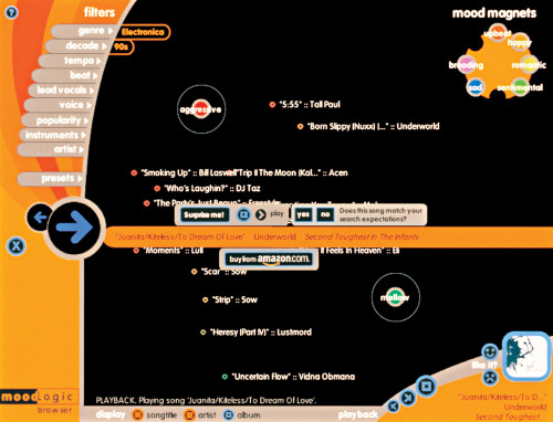
MoodLogic: Magnet Browser
Triplecode, Beverly Hills, California, 2000
Description
The MoodLogic browser allows people to search for songs based on musical characteristics and moods. The primary task was to organize songs based on their relationships and display them in a way that would make sense to the user. Songs were selected from a more than 24-dimensional data space with attributes like song name and title, information about how people perceive the song and abstract signal processing information. It was important that the user’s experience be intuitive and simple. We worked closely with MoodLogic to develop an interface concept in which users could search and explore songs using a combination of “filters” and “magnets.” Filters limit the songs displayed, and magnets help visually arrange them into meaningful distributions. Visually, the interface plays a secondary role to the content. While there are design elements on the screen, they are less important than the system’s content, and so are only minimally treated.
Credits
- Design firm
- Triplecode
- Designers
- Lindi Emoungu, Pascal Wever, David Young
- Client
- MoodLogic, Inc.


